COPD Care Plan
ViiMed was asked by COPD Foundation to create an interactive educational program for patients diagnosed with COPD. Our ultimate goal was to engage, educate and change patient behavior.
Problem
COPD Foundation handed us their patient handout, The Big Fat Reference Guide, a 300 + page book filled with everything a patient would ever need to know. ViiMed's only healthcare experience thus far was in Orthopaedics but we knew our Chronic Disease template had to be more engaging for a patient population that was never going to be cured.
Collaboration
The majority of the company (CEO, developers, solution architects, marketing, product, designers etc.) met in a conference room together and broke off into teams to tackle different ideas and concepts for creating a personalized care pathway.
To make the content tailored to the patient we decided to divide the program into three separate care plans (mild, moderate and severe) and the patient was assigned a pathway based off their assessment score.
Ideas
The Front-end Software Engineer and I worked together with the nurse that worked at the COPD Foundation to gain insight on users' behavior (both the nurse or 'coach' and the patient).
We compared the product to many existing educational platforms and discovered that in order to make the program more engaging and interactive, we could introduce the idea of gamification. This would be the first time we introduced any sort of gamification ideal into the software.
Solutions
Wireframes, Prototypes, and Final Products
The Dashboard
The Original Dashboard
Most of ViiMed's products up until this point, revolved around orthopedics, and therefore the patient did not need to have a "dashboard." They just logged in and went straight to their activity list.
The Solution Architects used the page builder on the software to create a patient dashboard. The page builder on ViiMed's platform, serves for simple projects such as libraries and such.
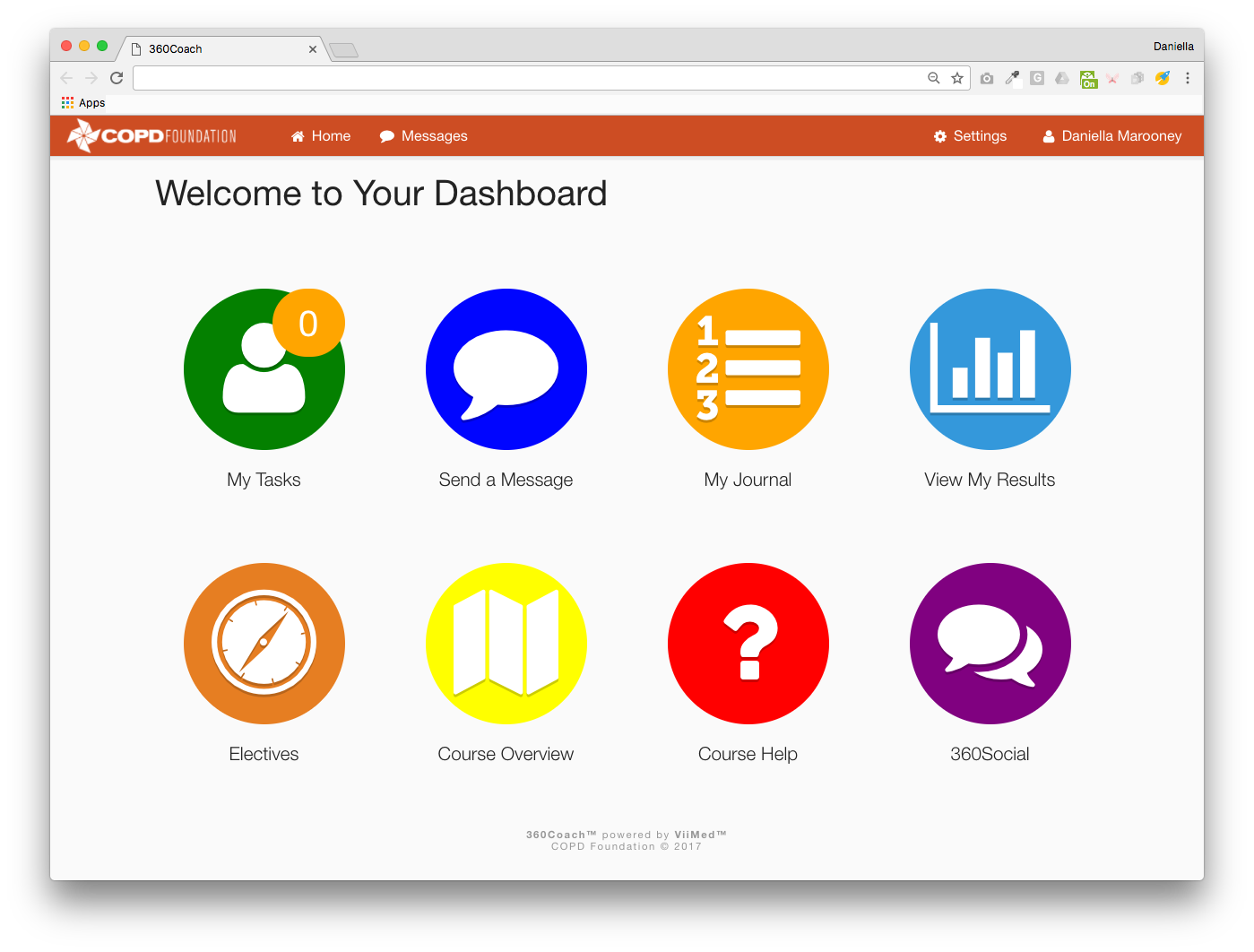
Looks boring, right?
With the thought of gamification in mind, I decided to begin sketching out wireframes that not only improved the overall look and feel of the dashboard, but also incorporated some gamification elements to it such as: unlocked achievement badges, a trophy room where patients could use their points to purchase a bluetooth inhaler that connected to the platform (or other goodies), etc.
-
UI Document for Patient Dashboard
I created a UI document with existing widgets the platform already had (only the design was tweaked) in order to have a back-up plan for the minimum viable product.
View Document -
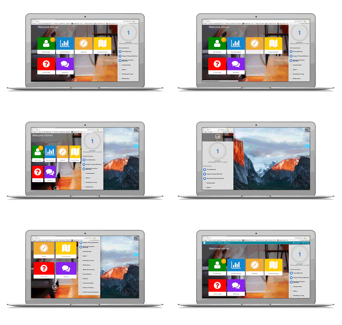
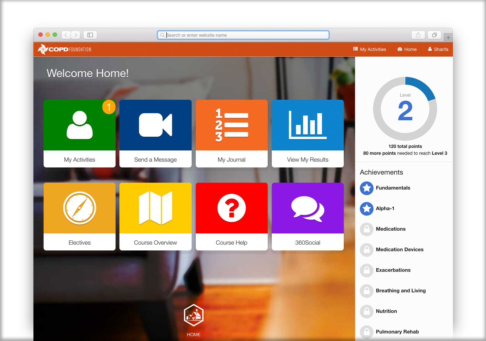
The Dashboard with Gamification
These collection of wireframes show the gamification ideas like integrating our platform with the COPD Foundation’s social media site, trophy rooms where where patients could use their points to “purchase” helpful items (bluetooth inhalers, pulse oximeters etc. that integrated with our software).
View Document
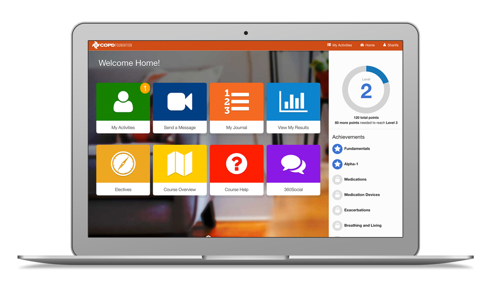
The Final Dashboard Product
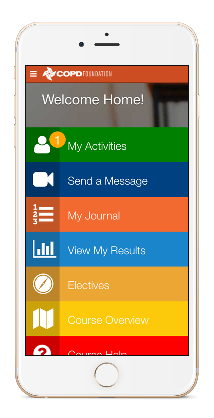
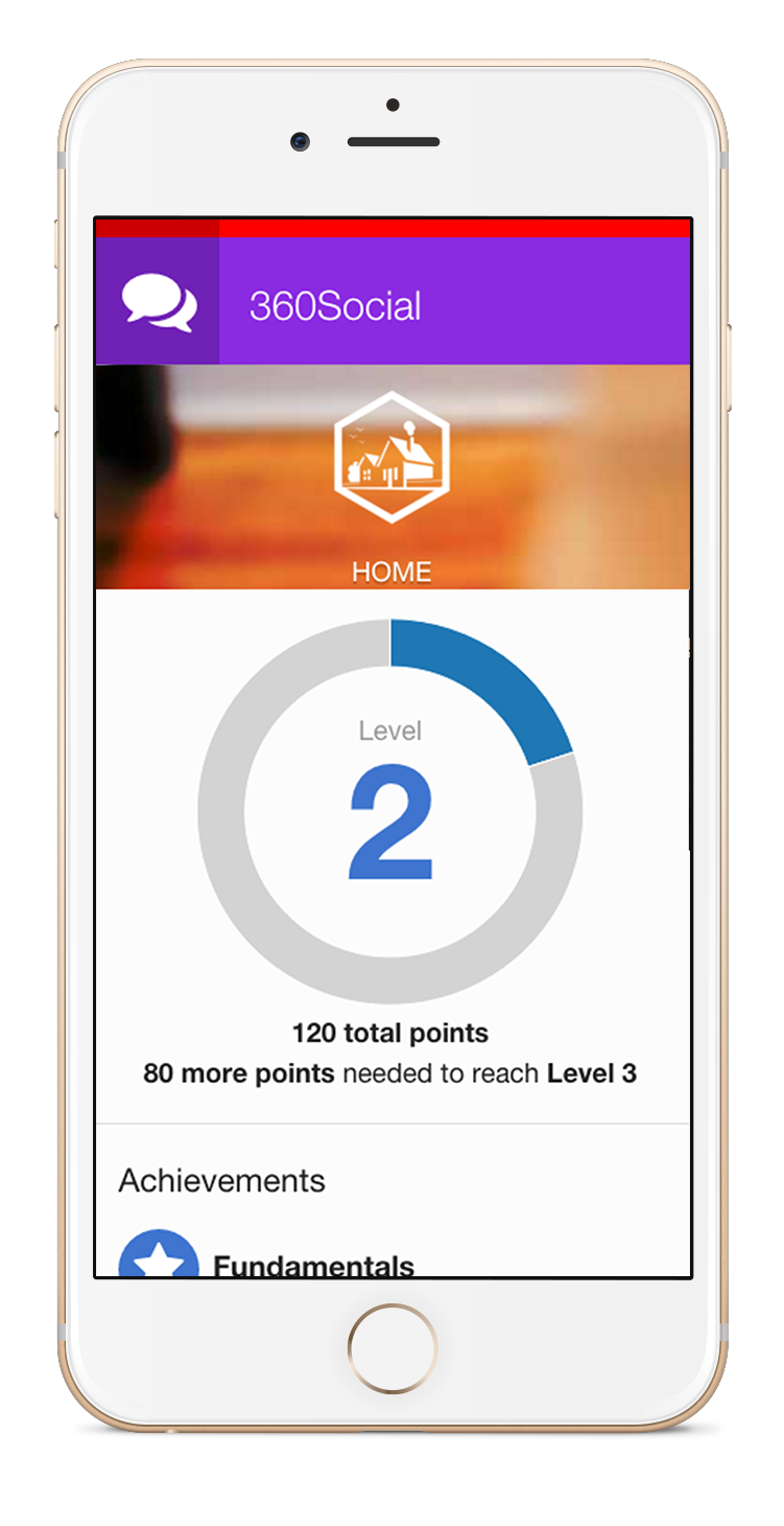
Using the page builder and existing widgets, I had to override the existing CSS code on the backend of the software (using inspect-element to replace the styles of existing classes attached to the widgets) to make the widgets have the "square design" and intended hover and mobile-view effects.
Mobile: Before
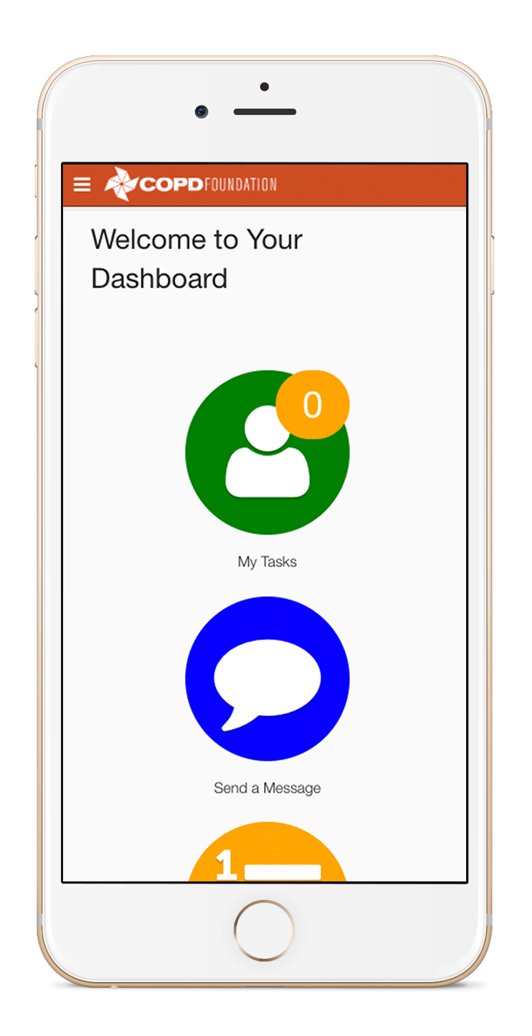
Mobile: After
Desktop View
Gamification
The Lead UX and UI Designer and I worked together with the nurse that worked at the COPD Foundation to gain insight on users behavior (both the coach and the patient). We did a lot of secondary research as well and read Gamification by Design by Gabe Zichermann and Christopher Cunningham because we came up with the idea to gamify the experience for the patients in order to encourage them to participate in educating themselves on their disease to manage their health and elongate their life.
Theme Development
From "Lung Island" to Real-World Environments
The COPD Foundation's "Big Fat Reference Guide" book takes on the theme of a safari and exploration on "Lung Island". Any "call outs" or "did you know?" blurbs included a graphical cartoon explorer dressed in safari gear. I worked closely with ViiMeds front-end software engineer took their theme of "Lung Island" and expanded upon it by creating different environmental realms that one would travel through on a game board and applied it to the Care Plan Courses. Each aspect of the program (from individual chapters in a course to library resources) was assigned an "environment."
A Journey Through the Environments
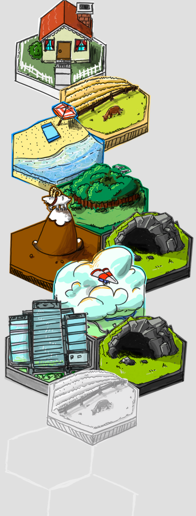
Home
Home base, and where you can always return. Elements such as the dashboard, the patient journal, or messaging your coach would take on this theme.
Beach
The beach is where one goes to relax, play games, take a break from daily routines. This theme would essentially be applied to the trophy room, social media integrated with the platform etc.
Mountain
The mountain is an "uphill climb" and represents a challenge. This theme was applied to a "practice" activity that was sent to the patient during each individual course. An example of a "practice" activity included side-by-side recordings of patients completing pursed-lips-breathing exercises or other copd-related exercises that help them gain control of their disease.
Farm
The farm, or "the simple life," represents simplicity and the basics. This theme was applied to all introduction chapters of each course.
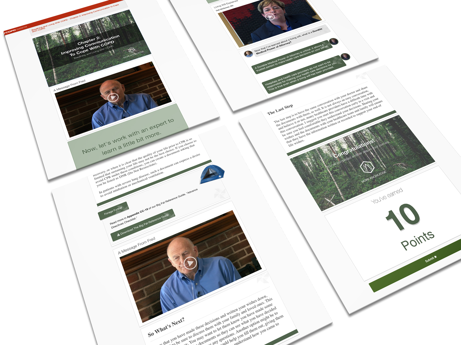
Forest
In the forest, one goes exploring deeper into nature, thus representing "deeper information." The middle chapters of a course (patients are exposed to deeper knowledge on the topic) would take on this theme.
Sky
One can see "everything" and has a broader view of an area from the sky. The sky represents a review of all information learned in a course or exit surveys testing the patient's knowledge on the topic.
Cave or River
The idea of the cave or the river (we went along with the river) represents a detour or side quest. Elective courses were assigned this theme as an optional "side activity."
Theme & Gamification in Action
I designed and created elements that went along with each theme. Once we began building out the care plan, we realized that for the first launch, we did not have a need for some of the "environments," so we eliminated "town" and "beach."
Farm
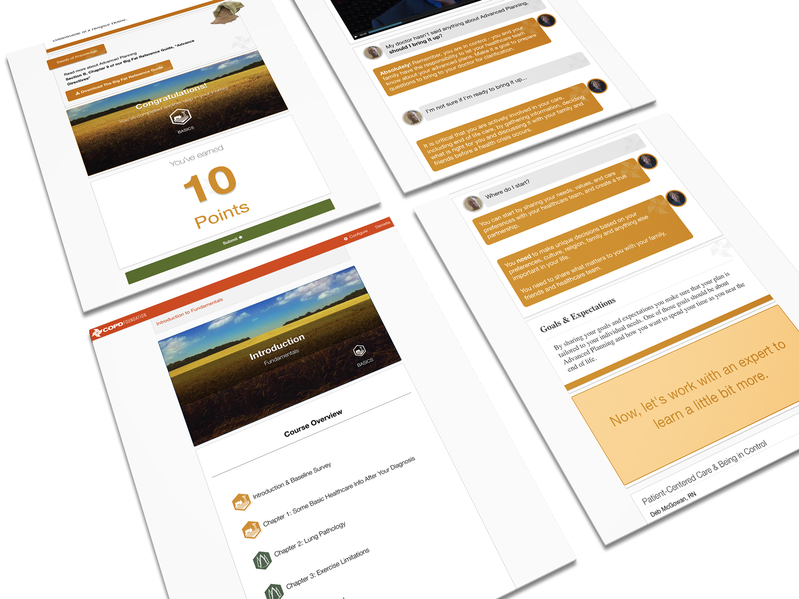
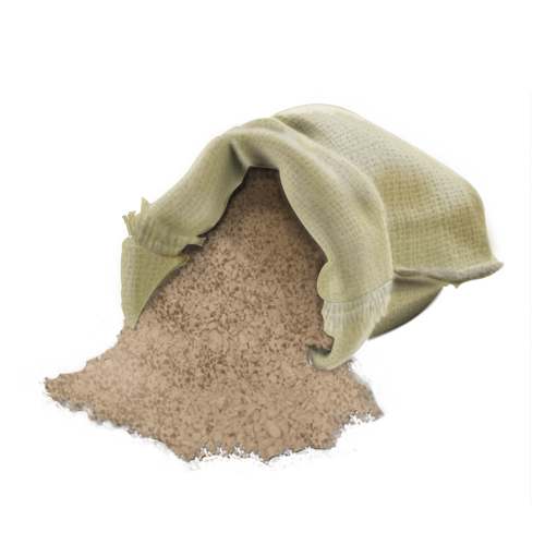
Bag of Seeds
Created in Adobe Photoshop

Shovel
Created in Adobe Photoshop
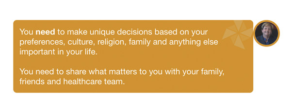
Chat Bubble
CSS & HTML
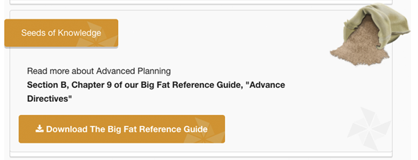
Download Box
CSS & HTML
Forest
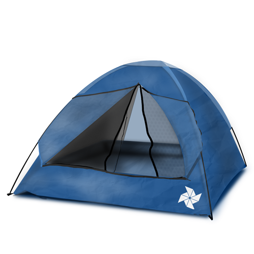
Tent
Created in Adobe Photoshop
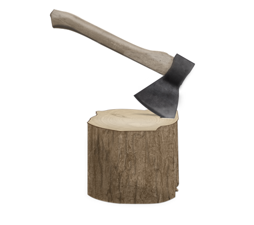
Axe & Stump
Created in Adobe Photoshop
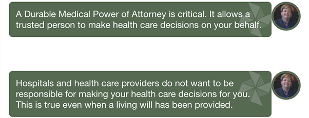
Chat Bubble
CSS & HTML
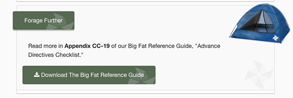
Download Box
CSS & HTML
Mountain
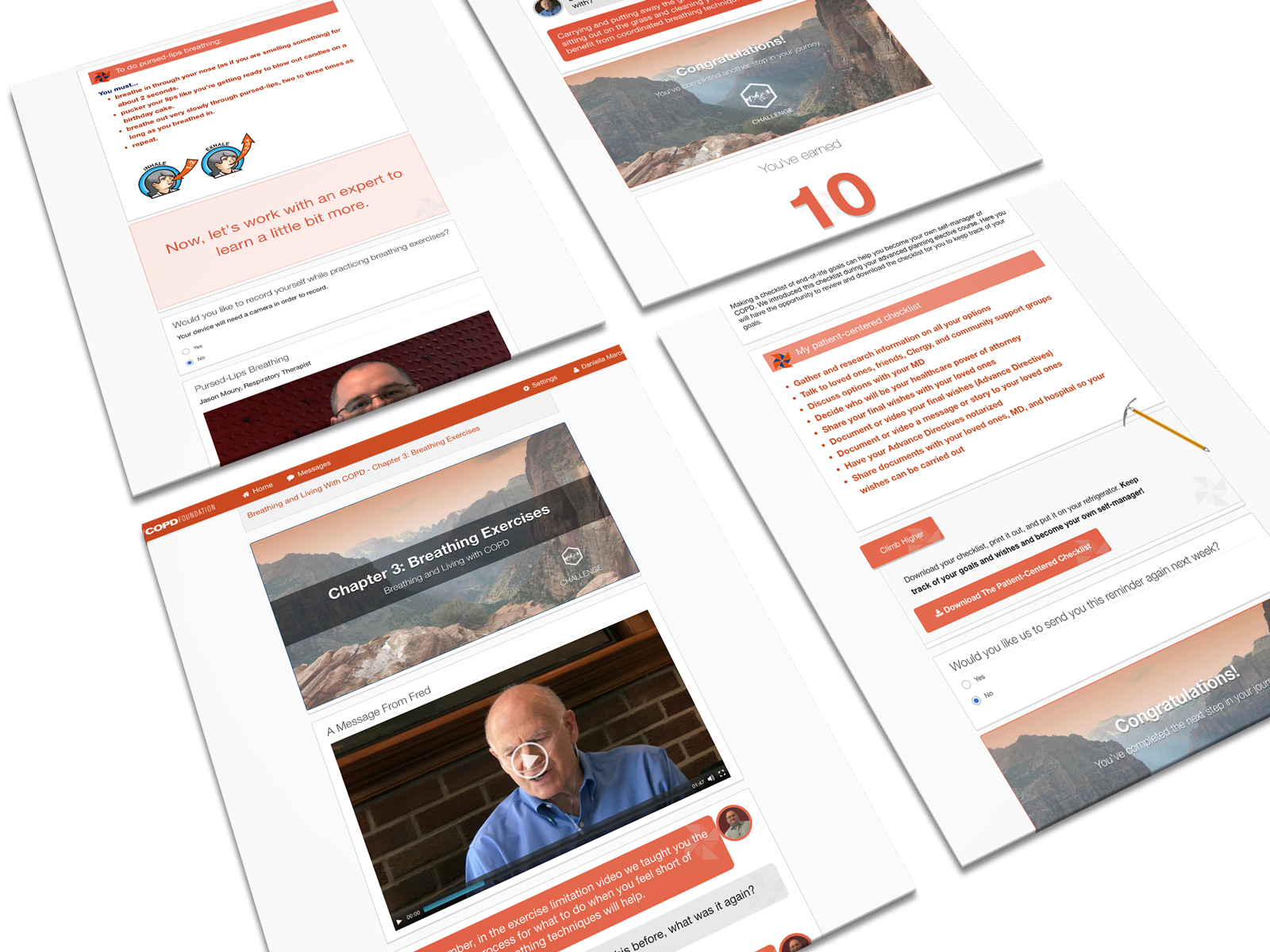
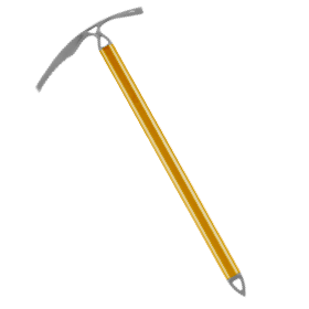
Ice Axe
Created in Adobe Photoshop
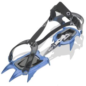
Crampon
Created in Adobe Photoshop
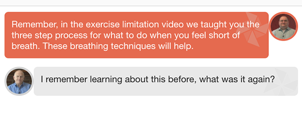
Chat Bubble
CSS & HTML
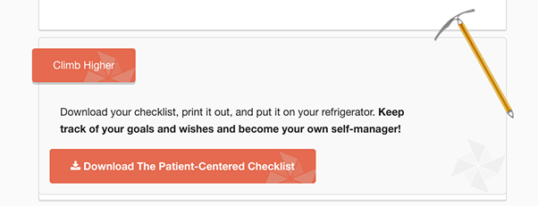
Download Box
CSS & HTML
Sky
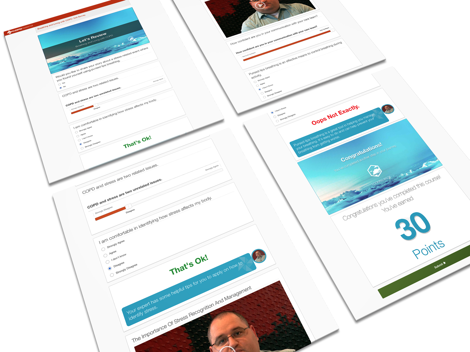

Cloud
Created in Adobe Photoshop
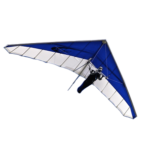
Hang Glider
Created in Adobe Photoshop
Chat Bubble
CSS & HTML
River
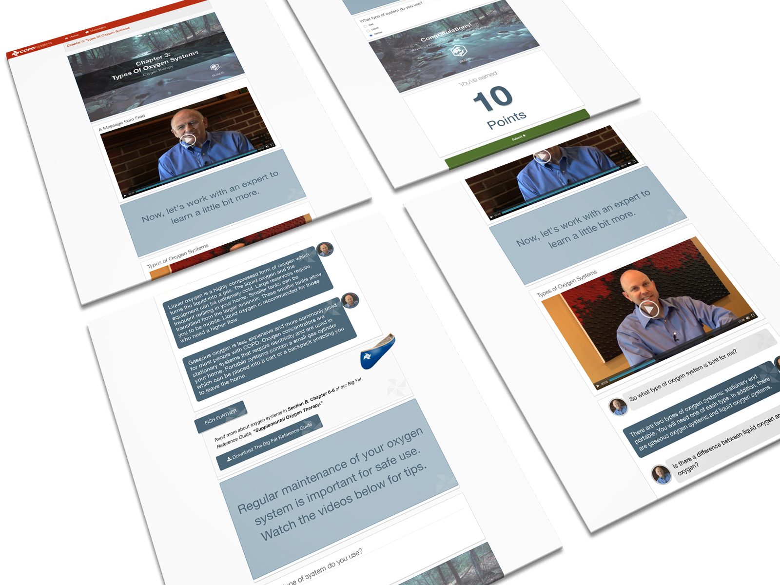
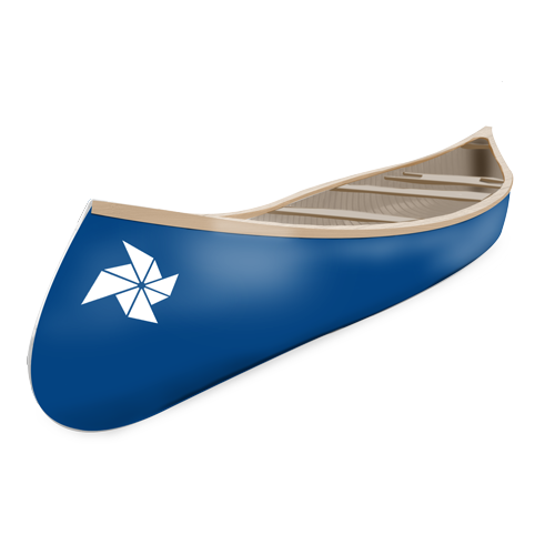
Canoe
Created in Adobe Photoshop
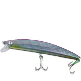
Fishing Lure
Created in Adobe Photoshop
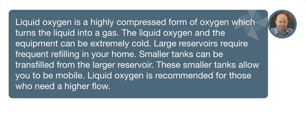
Chat Bubble
CSS & HTML
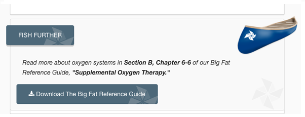
Download Box
CSS & HTML
Home
COPD Care Plan: Impact and Feedback
I created a user survey for patients to fill out while they were completing their program. We asked them all sorts of questions regarding the design, navigation, workflow, and gamification. Most said they really enjoyed the theme and gamification aspect, but that they did not see it as a motivating factor for them. We came to the conclusion that perhaps there was no correlation to motivation because patients could not do anything with their points (e.g., purchase items in a trophy room).
The COPD care plan was up and running. The theme elements and ideas that the Lead UX and UI designer and I developed became a large turning point for how we approached all other care plans. The elements we build were so often reused for other care plans, that we eventually built widgets out of them for solution architects to use instead of copying and pasting HTML code.
