Stratus Step by Step Spending Plan
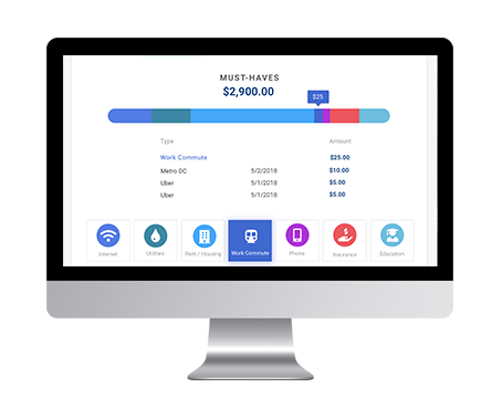
I redesigned the spending plan as a step-by-step flow to help users understand the purpose of the spending plan and how they will be using it.
Who is this for?
Millenials between the ages of 23 - 33 struggling to understand finances and pay down debt. Our main focus is the "Struggling Steve/Stacy" who needs to pay off student loans, cover necessary expenses, and needs help with future financial planning. This user needs help creating a spending plan to help reach their goals.
What is the Problem?
The original low-fi mockups and multiple iterations of hi-fi mockups were tested with target users. Users were confused about what actions they needed to take with the spending plan. They also did not understand the connection between creating a spending plan to reach goal of "Spend less than you earn / Avoid New Debt."
A Few New Requirements & Solutions
After 3 - 4 iterations and multiple rounds of user testing, our product manager developed requirements based on new user needs.
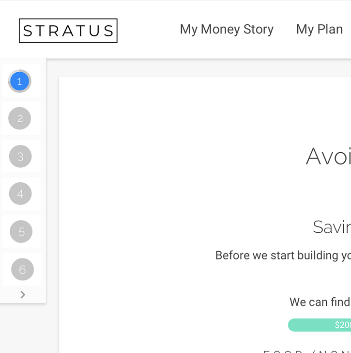
- User does not know where they are in the flow and how much "time" or how many steps they have left to complete.
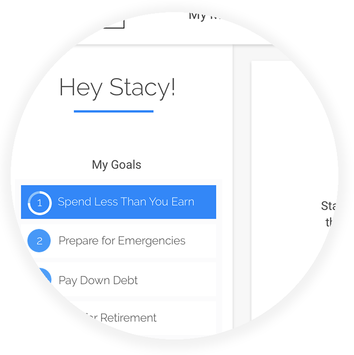
- Designed and implemented progress circle on menu item.
- User needs to be able to take action and set spending for "Must-Have" categories prior to landing on spending plan interface.
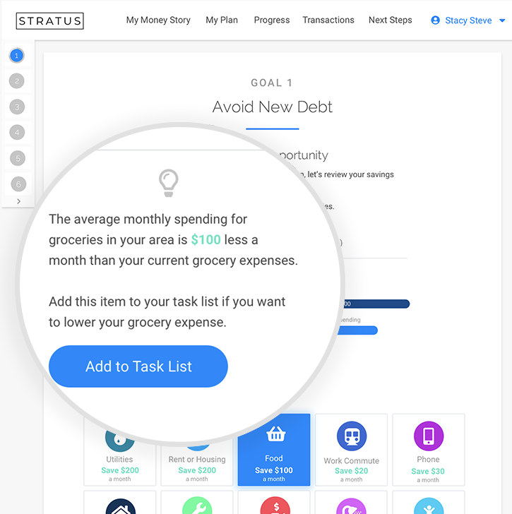
- Redesigned flow to show how much user could be saving in these "Must-Have" categories and the take action by "committing" to spending less which automatically sets the spending for this category in the spending plan.
- User is distracted by menu of goals on left-hand side
- Designed the menu to collapse after first screen.
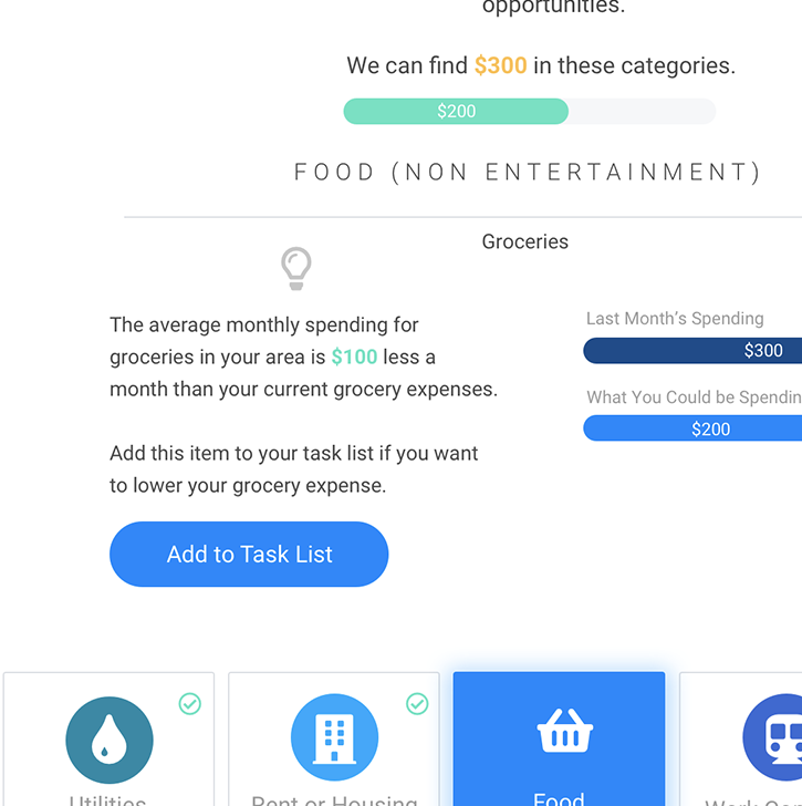
- User needs to know how much they are finding in savings as they commit to spending less in each category.
- Designed a progress bar to aggregate as user "commits" to spending less in each category. I also added a check mark on categories they have committed to.
User Flow
1
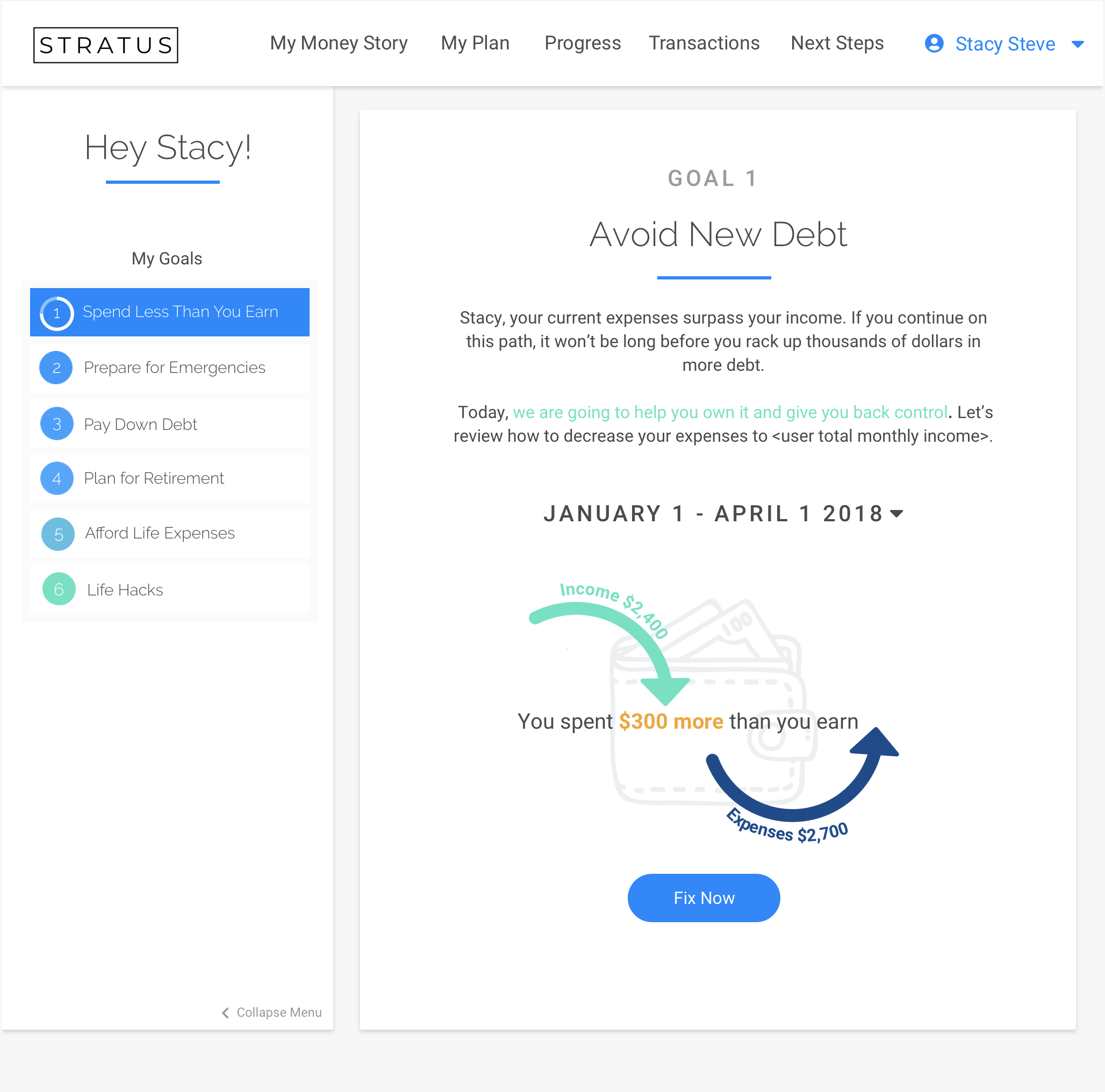
User is dropped in Goal 1 flow (Avoid New Debt - or Spend Less than You Make) after onboarding flow if Stratus calculates that user is overspending.
2
User clicks "fix now" to an overview and introduction of the spending plan.
3
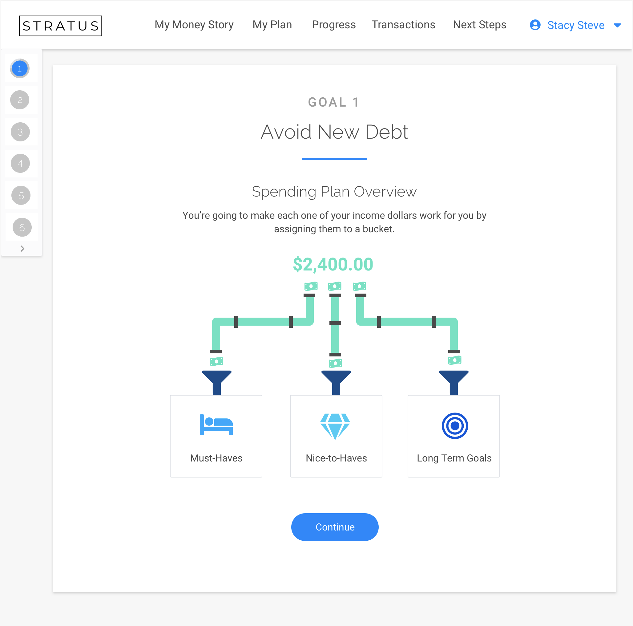
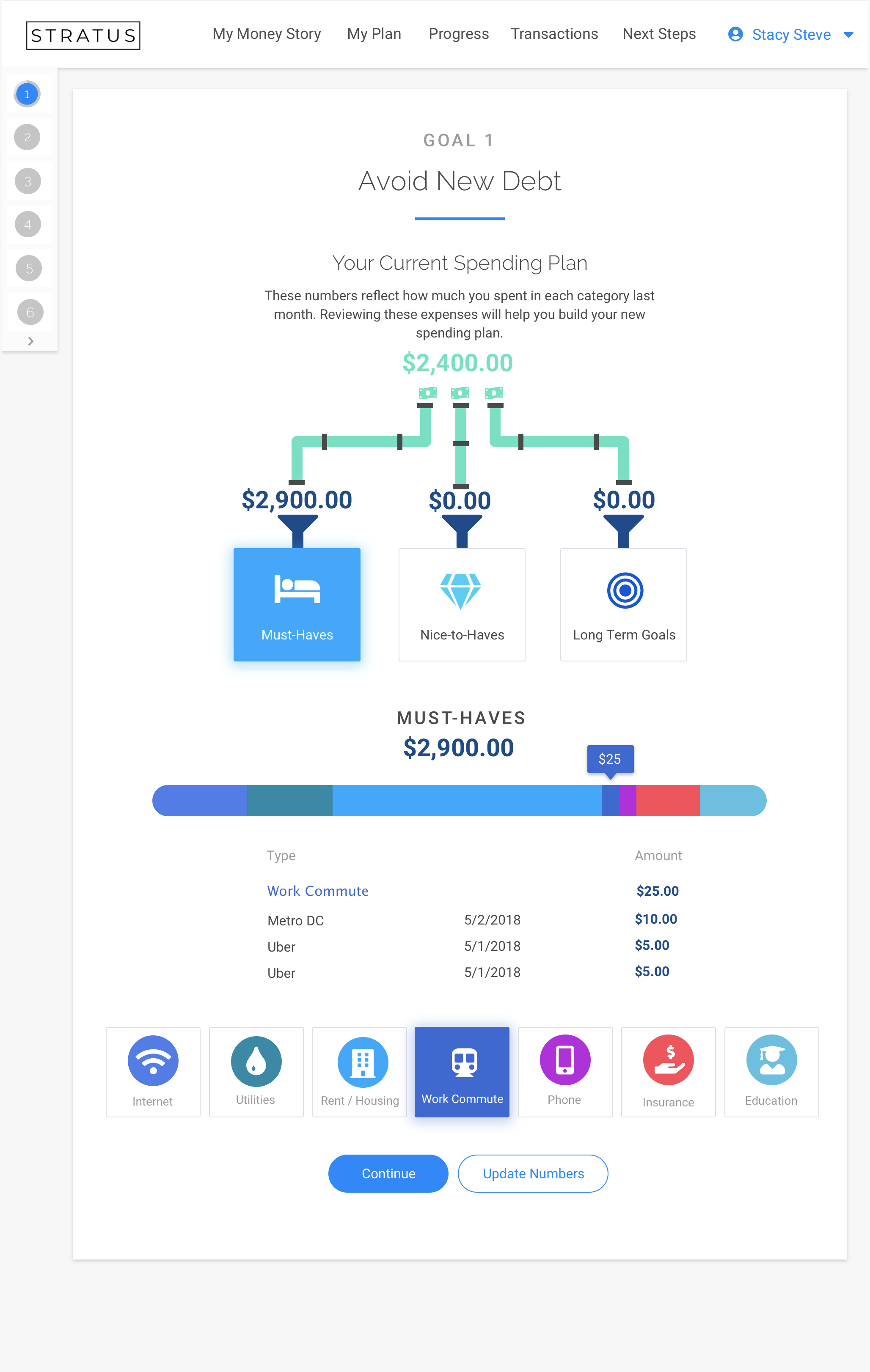
User clicks continue to view their spending as it pertains to these buckets. User can click the buckets to get a more detailed overview and explanation of the spending plan and how it works. They can drill down and see their spending has been in each category.
4
User clicks continue to view savings opportunity in each category.
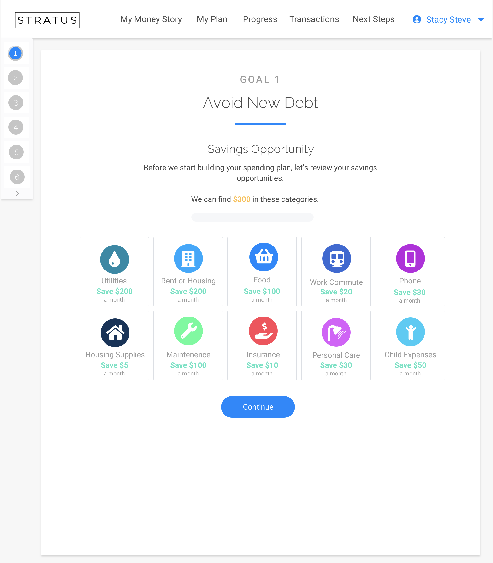
5
User views opportunity to find overspent money and agrees to spending less in that category. This is automatically adjusted in their spending plan.
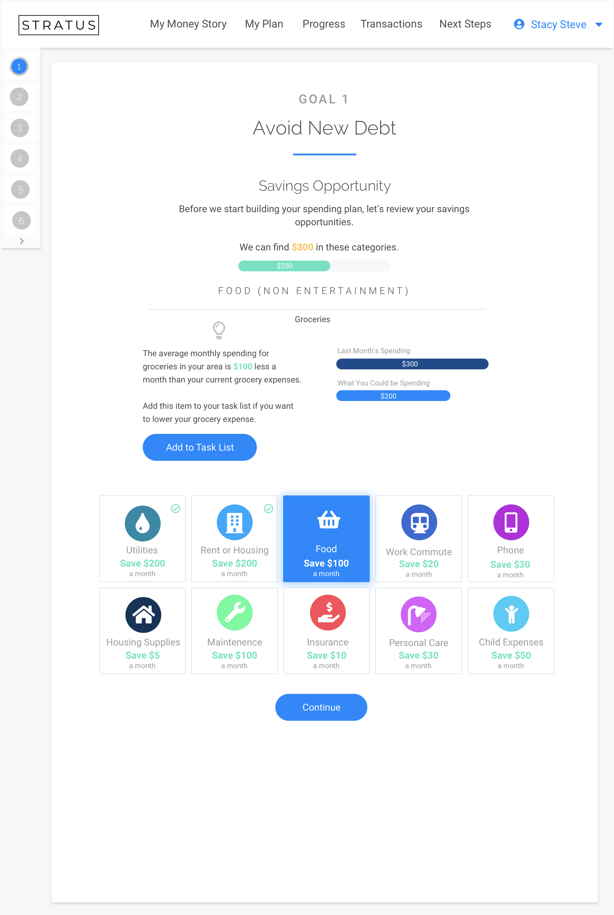
6
User is ready to view and adjust spending plan.
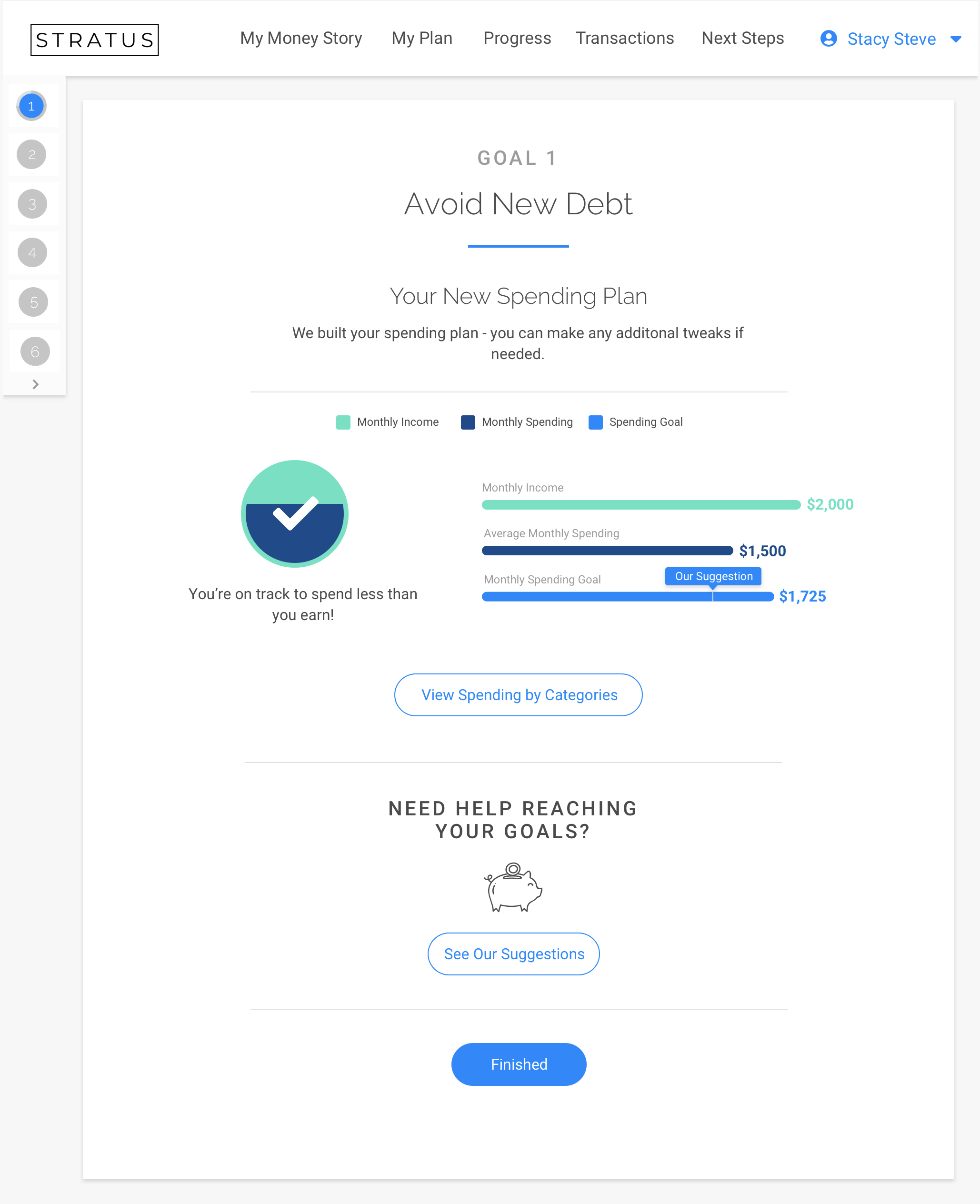
7
User can drill down deeper for details.
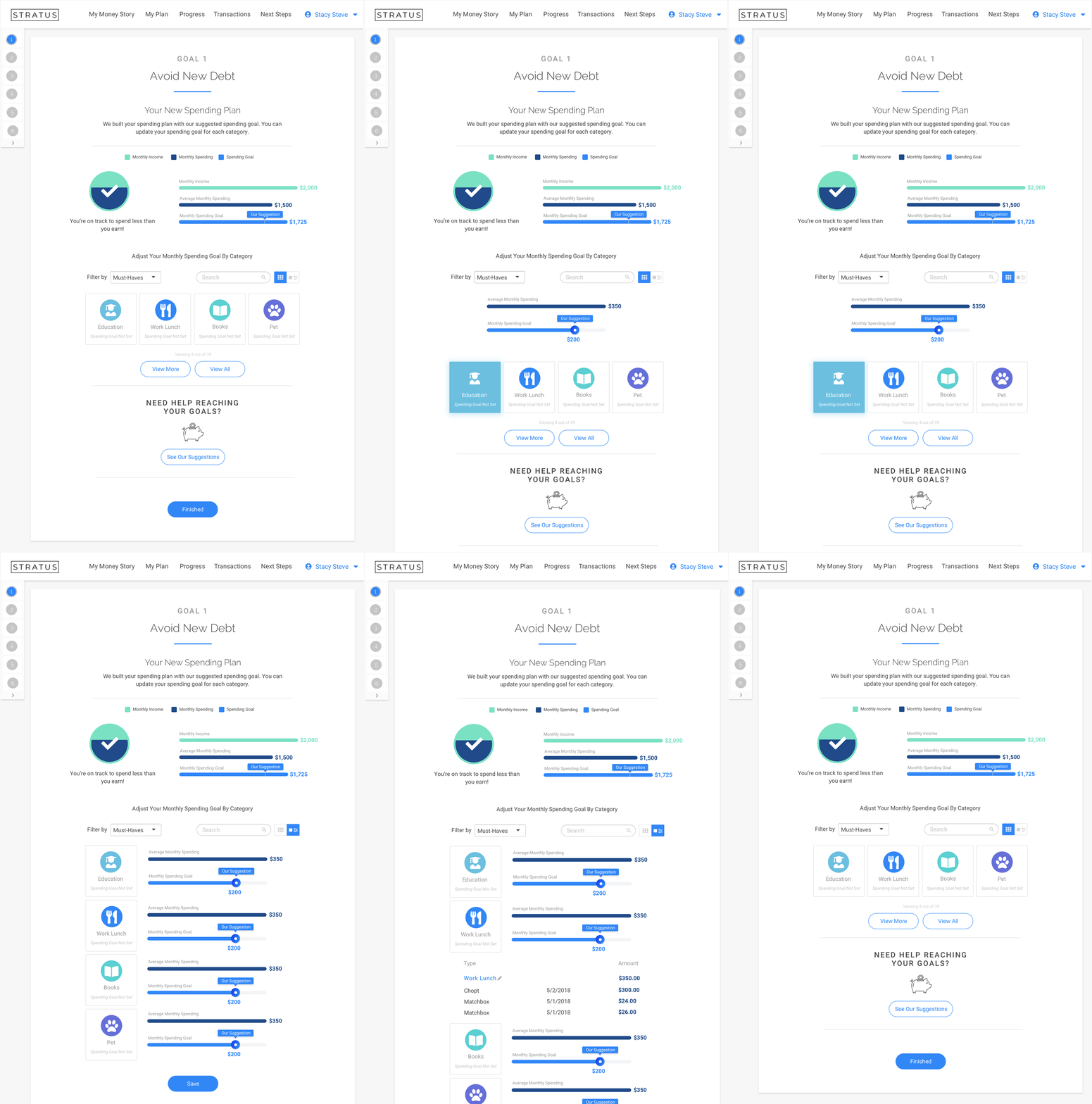
Low-Fi and Hi-Mockups & Prototypes
-
Savings Opportunity Screen Low-Fi
This was the first low-fi mock for this screen which included mostly numbers and data instead of explanations and personalization.
View Document -
Spending Plan Low-Fi
User is unaware of what action to take and seems to resemble more of an excel spreadsheet than an interface. This was one of the first low-fi mocks for the Spending Plan.
View Document -
Spend Less than You Make Hi-Fi
First hi-fi mock of this interface - you can see the menu is clunkier here and was too confusing and distracting for users.
View Document -
Spending Plan Hi-Fi
First hi-fi mock of spending plan. The sliders were way too tiny for users and when implemented with all 32 spending categories it became daunting and overwhelming.
View Document -
Savings Opportunity Hi-Fi
Second or third hi-fi mock of savings opportunity. Users did not connect the suggestions we made with to their spending plan.
View Document -
Spend less than You Make Low-Fi
First low-fi mock of the first landing page of the interface (where we now have the wallet).
View Document