CHF Care Plan & Nurse Admin Dashboard
I worked directly with a cardiologist to come up with a Congestive Heart Failure (CHF) program to build with ViiMed’s platform. This product involved the re-design of the existing nurse coordinator dashboard.
Problem
Hospital systems have a big issue with Congestive Heart Failure patients in that they get readmitted back to the hospital post-discharge. Not only is this very expensive for the hospital, but it also reduces patient satisfaction scores and HCAHP scores.
The Clinical Director and Fellowship Program Director for Cardiovascular Medicine at the University of Louisville approached ViiMed with the idea of creating a remote care plan for CHF patients after they leave the hospital. The idea behind the program was to minimize hospital readmissions during the critical 30 day period after the patient is discharged from the hospital.
The Workflow
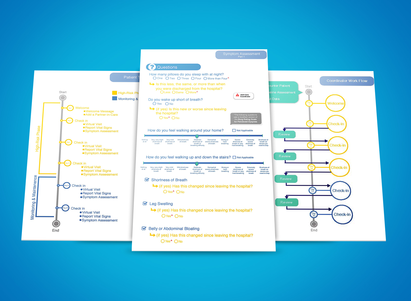
The clinical director and I sat down and reviewed the typical problems congestive heart failure patients have when discharged from the hospital. Based on the typical timeline that a patient experiences significant changes with vital signs and recovery, we developed a workflow that triggered three activities every 7 days for the patient to complete (virtual visit where they record themselves or take a picture of how swollen their ankles are, recording and measuring vitals with bluetooth devices that integrate with the software, and a symptoms assessment).
Based on the patient’s response to each activity (if the vital signs were recorded out of range, symptoms responses that indicate a problem, or images that indicate an issue with the swelling of ankles) an alert would be triggered if there is an issue and the patient would be prioritized in red to the top of the dashboard so the nurses and care coordinator can intervene.
The Original Nurse Admin Dashboard
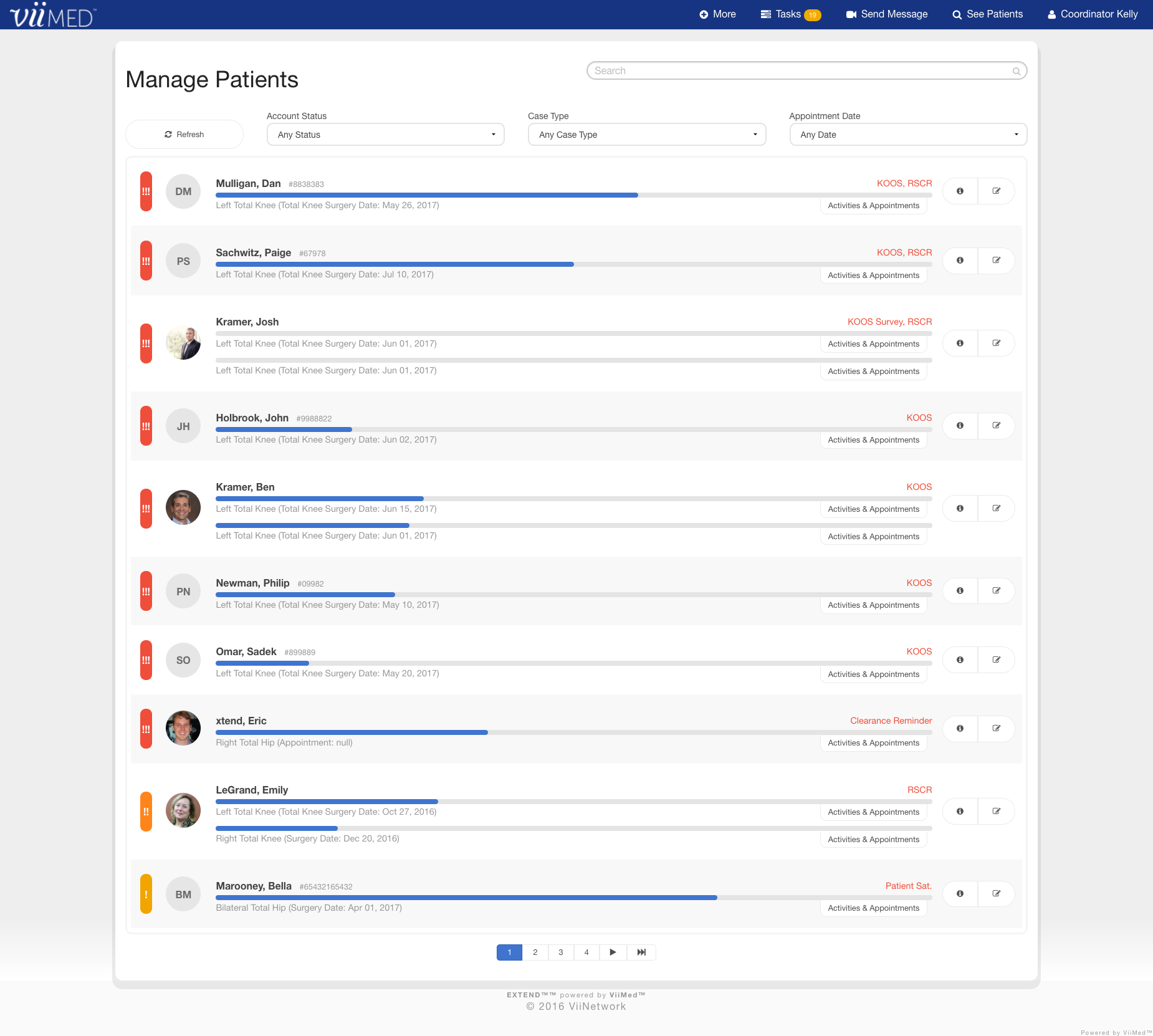
The existing ViiMed coordinator dashboard works very well for nurses who need to monitor patients throughout their orthopedic pathway. However, with congestive heart failure, it does not provide the high-risk alerts and prioritization needed to monitor patients who are more likely to be readmitted back to the hospital. It gives no insight at first glance when the patient’s discharge date was or what tasks the nurse or care coordinator need to complete in relation to each patient.
Mockups & Prototypes
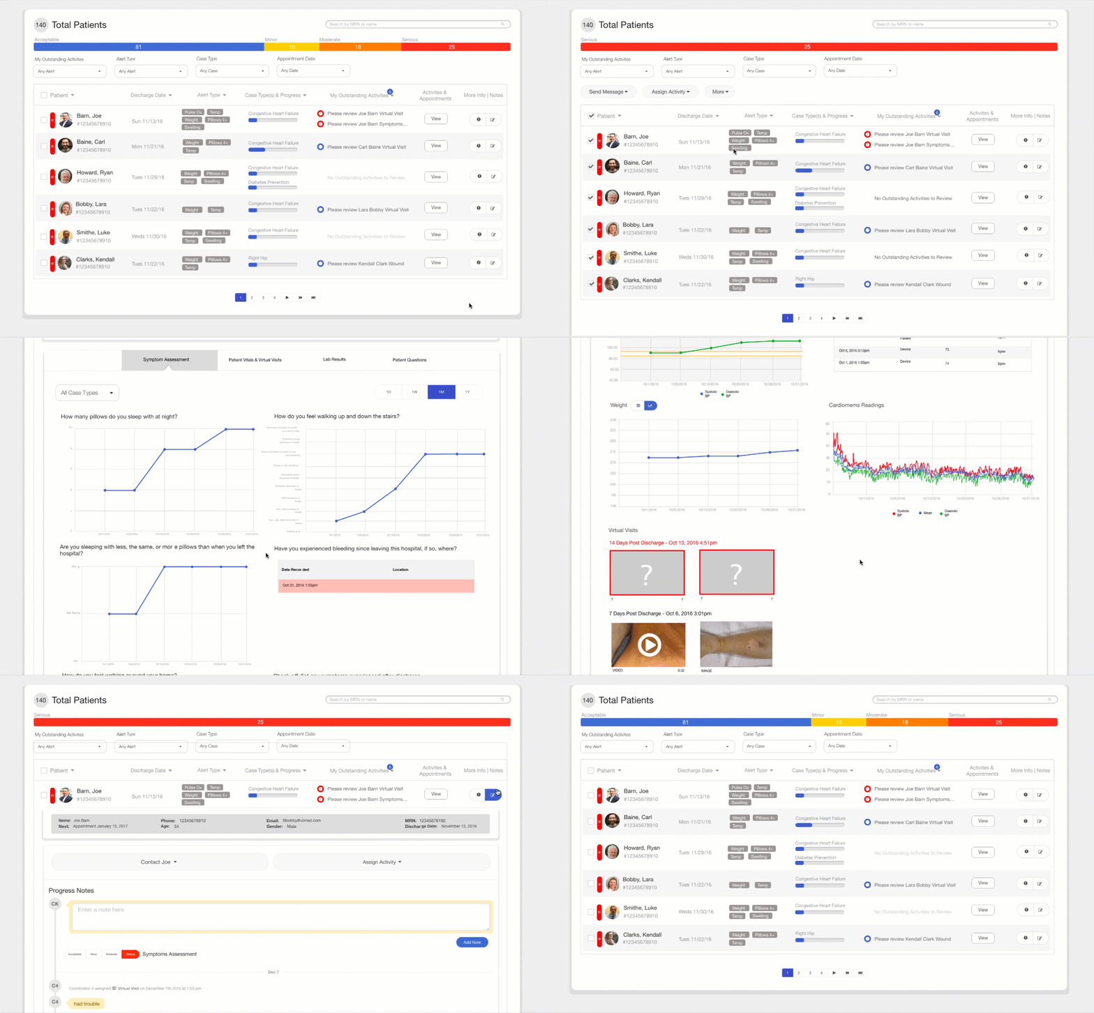
Working with the Clinical Director, I created various mockups with new features that would help the nurses monitor patients with congestive heart failure. I had to keep in mind that the elements of the dashboard had to be generic enough that it would work for orthopedics as well as other use-cases or products.
-
Too Much Text
The black paragraph you see on the upper left of the patients' progress bar is a string of data collected from the enrollment form (the nurse fills out a form on the software to enroll the patient into the program prior to when they leave the hospital).
View Document -
Two Interfaces Become One
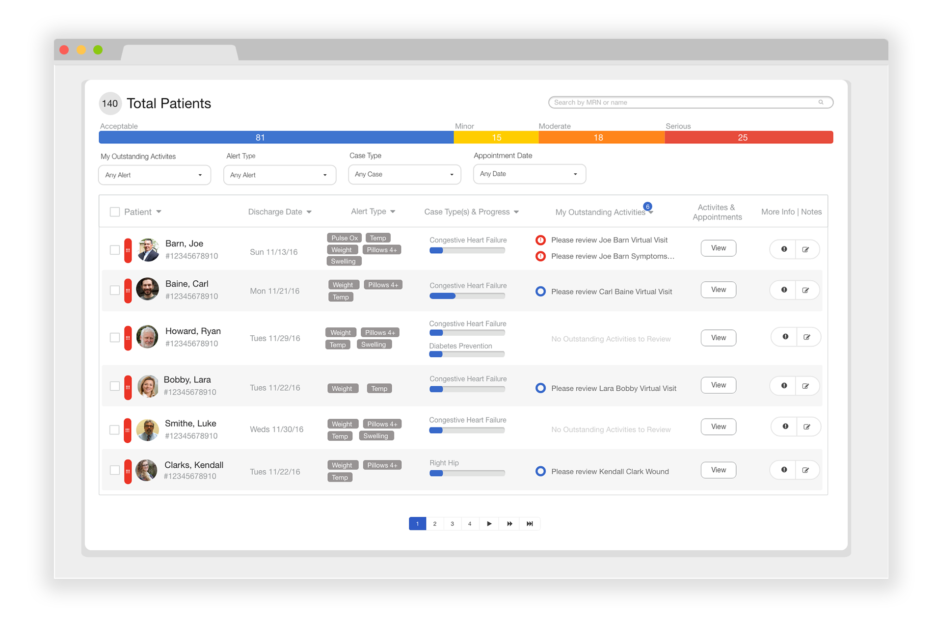
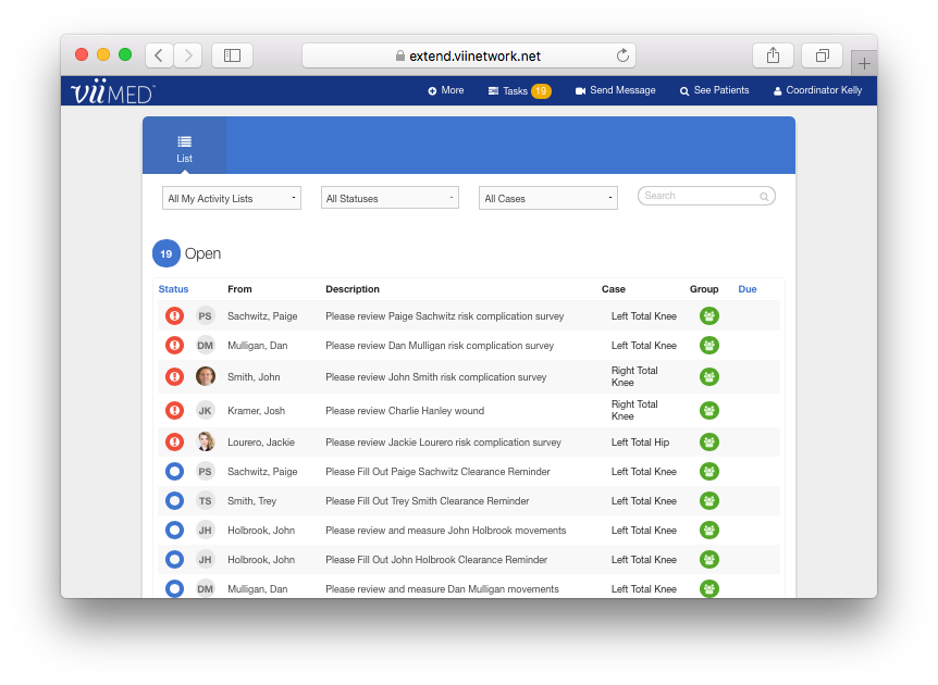
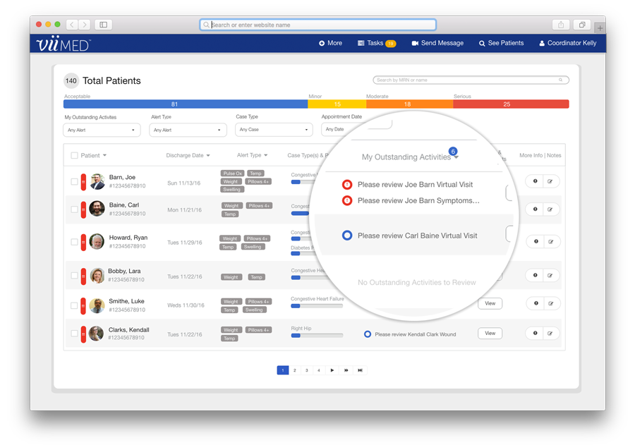
The nurse admin's to-do list is embedded within their dashboard where they manage their patients (two interfaces becoming one so they don't have to jump back and forth). It is also an overall view of each patient's severity rating. Clicking on an individual dot on the scatterplot allows the user to "drill down" into that patient's medical profile.
View Document -
The Winner
It shows a high level view of the number of patients in each severity category, and allows for generic use for all use-cases. We discussed that this dashboard view was essentially easier for the dev team to tweak as it contained the majority of the existing features, but in a different layout.
View Document
Challenges I Faced
Although the cardiologist I worked with gave great insight and ideas for redesigning the care coordinator dashboard, I knew it only solved the problem for a CHF care plan.
The Solution
Keeping in mind that products should not be made for one user, but rather all users I knew the dashboard needed to have generic features that can multiply across all use-cases. I researched multiple administrative dashboards and how they worked for different products.
Merging Two Interfaces
I took into account feedback received from the orthopedic nurses about moving back and forth between the dashboard and their tasklist to complete their daily activities as well as the cardiologists suggestions for being able to mass send an activity to patients, seeing how many patients at once are high-risk, as well as other necessary characteristics to determine the priority of congestive heart failure patients.
To-Do List Interface
To-Do List Inside Dashboard
See it in Action
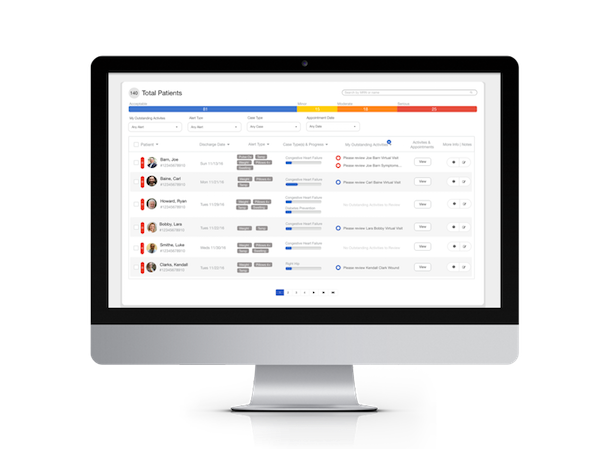
The design you see below mimics that of an e-mail dashboard where one can select multiple e-mails at once (in this case it is patients). The majority of the columns displayed on the dashboard would be default settings with the exception of some that could be configurable by the solution architect depending on the client (e.g., instead of discharge date for congestive heart failure use case, the Solution Architect could choose surgery date instead for the orthopedic care plan).
