ViiMed Website
The ViiMed website went under a lot of iterations. This page shows all the wireframes and Screenshots of different iterations of ViiMed's Website that I designed and developed.

Problem
ViiMed needed a website that spoke to its primary target audiences, CFOs at health systems (primary audience), patients, doctors and nurses. The website needed to address how the product was THE solution for health care. The original website was extremely text-heavy and did not explain what the product did, or how it helped health systems be more efficient and make doctors and nurses jobs easier.
Wireframing & First Build
Upon my first year of working there, a month or so after being hired from the internship position we decided to re-do the website. The Lead UX and UI Designer and I worked together with our CEO to map out the content for the website and then create a design based off the flow of the content.
We looked at different websites we liked, and analyzed the story they told. We chose similar design elements that we liked to include in our website. Once I drew out the wireframes, I began building out the site using Yeoman, Grunt, and Bower (scaffolding package for creating websites).
-
Wireframe 1
View Document -
Wireframe 2
View Document -
Wireframe 3
View Document

Solution & Final Product for First Iteration
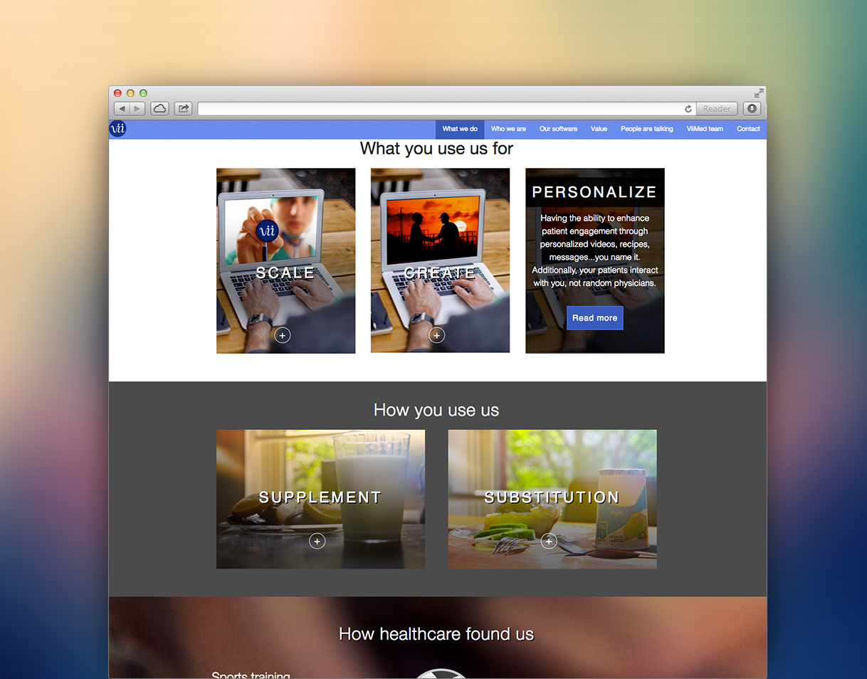
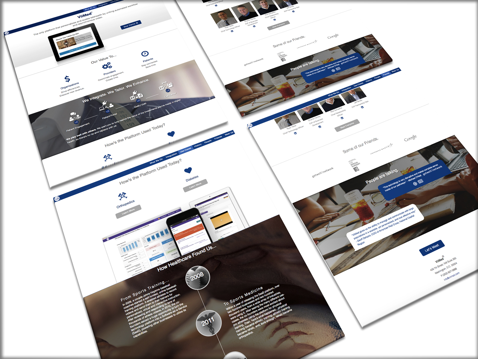
While constructing the website based on the wireframe was a great start, many things changed along the way from the first wireframe. We began to realize that certain elements didn't correlate with our messaging, and thus we changed the design while we built. I sat in a conference room with my CEO to finalize the content and edit sections at the same time.

See it in Action
Problem #2
The Next Remodel
The previous website I built held up well, but Marketing, Sales, and my CEO could not edit or update any content without having to go through me to update the code.
I moved the website over to WordPress to make it easier for anyone to go in and add content. This made it easier for design purposes because I worked with Marketing and our CEO to re-do and re-design the website within 5 days. Each of us worked on a different page - they wrote the content, and I did the artwork as well as designing the layouts.
I learned how to override existing code that existed in the WordPress theme we purchased to make elements look the way I wanted them to. I also added custom CSS to tweak the look of the generic theme template.
Solution & Final Product for Second Iteration
-
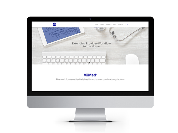
ViiMed Home Page Banner
View Document -
ViiMed About Us
View Document -
ViiMed About Us
View Document -
ViiMed About Us
View Document -
Product & Value Propositions Section
View Document -
What We Do Section
View Document
Problem #3
Productizing the Platform & Solving Isses with Bundled Payments
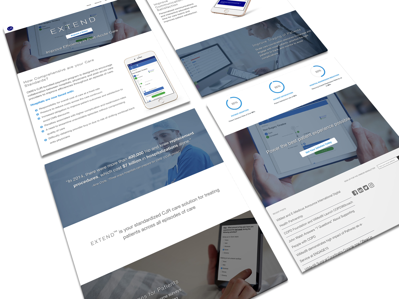
In 2016, the healthcare industry began to face an issue with CJR (comprehensive joint replacement) and bundled payments. ViiMed''s platform had a care pathway tailored to orthopedic surgery. Instead of labeling it as an individual use-case, we made the move to productize this care plan. The product was called "EXTEND."
I created a separate landing page for this product that told the story of how this product is a major solution for bundled payments. It was broken down into stating the problem, introducing our solution (EXTEND), and discussing how it helped solve this problem.
Solution & Final Product for Third Iteration
